A full branding package built around a new logo that captures the essence of the organization, covering the logo suite, typography, color palette, brand guidelines, and stationery.
Nonprofit
Branding, logo design
Full branding package
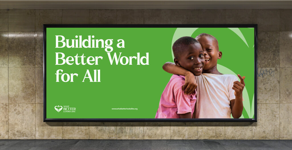
In their words
- Norma Loeb
Founder, Lewy Body Dementia Resource Center
01 · The client
What Better Looks Like is a nonprofit that helps people imagine, articulate, and create a better world, running community programs that bring people together and support those who need it.
They wanted a logo and a full set of brand assets that captured the essence of what they stand for and gave them a consistent identity to use across everything they produce.
02 · The Brief
The core of the brief was the logo. The goal was to create a mark that captured the essence of the organization, the spirit of what it does and what it stands for, in a form they could put their name behind. Around that logo, they needed a complete branding package, the typography, color, guidelines, and stationery, so the identity would hold together and stay consistent everywhere it appeared, from their website to printed materials.
03 · How Lucanix responded
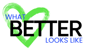
We designed a new logo that combines an icon with a wordmark, giving the organization a mark that works as a complete lockup and an icon that can stand on its own. The design was built to capture the essence of the organization, which was the heart of what they asked for.
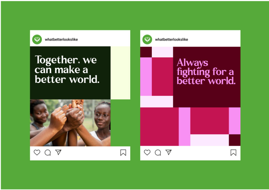
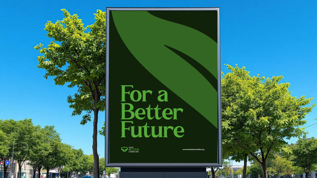
We selected the typeface for the brand, choosing type that suits the organization's character and pairs cleanly with the logo, so their written communications carry the same identity as the mark itself.
We built a color palette for the brand, defining the colors that represent the organization and how they should be used, so everything they produce looks like it belongs to the same identity.
Alongside the primary logo, we produced the full set of variations the organization needs in practice: the standalone icon, a horizontal lockup, and single-color versions for light and dark backgrounds. Each was delivered in the file formats needed for both print and screen, so the logo holds up wherever it is placed, at any size.
We designed a branded letterhead for their correspondence and documents, and pulled the whole system together into a set of brand guidelines covering how to use the logo, the typography, and the color palette. With that in hand, anyone producing something for the organization can keep it consistent.
04 · The result
What Better Looks Like now has a complete brand identity built around a logo that captures what the organization is about. With the logo suite, the typography, the color palette, the guidelines, and the stationery all in hand, they can present themselves consistently across their website, their print materials, and anywhere else.